Over the next few tutorials, we’ll be looking in more detail at the basic layout and graphical interface aspects of the Android API. If you’ve been reading other tutorials in this series, you’ve already been creating basic layouts, buttons, and menus; now we’re going to look in depth at the available layout and UI options, to give you more insight into how you can create the best visual user experience for your app.
This first tutorial looks at LinearLayout, as well as at some basic concepts like element attributes. In the next few tutorials we’ll also look at RelativeLayout, check out the multiple menu types available, take another look at lists, grids, and scrolling, and find out how to make buttons look better.
Layouts and XML: The basics
The basic Android approach to layout is to set it up in XML, in a layout file that is usually found in res/layout/. It’s also possible to then grab and alter that layout information programmatically at runtime as your app requires. (It’s also possible simply to instantiate your layout information at runtime, but that’s less flexible and maintainable than using XML, and I won’t cover it here.)
The structure of an XML layout file is similar to the structure of an HTML webpage — you can think of it as a series of nested elements, or as a tree. Each layout file has one single root element, which must be a View or ViewGroup element (such as LinearLayout, RelativeLayout, ListView…). The limitations of the arrangements of the child elements (panes, buttons, images, text… all the visual parts of your app) will vary according to the specific root element. Let’s look at what we can do with a LinearLayout.
LinearLayout: The basics
A LinearLayout is a very simple layout that just arranges all its children in either a vertical column, or a horizontal row, depending on how it is specified. A vertical LinearLayout will only have one child per row (so it is a column of single elements), and a horizontal LinearLayout will only have one single row of elements on the screen. There are obvious disadvantages to this for more complicated apps — you probably don’t want all your buttons to line up one under the other, for example. To set up more complicated arrangements, you’ll probably want to use a RelativeLayout (which we’ll look at in another tutorial); we’ll also have a quick look at nesting LinearLayouts at the bottom of this tutorial.
Here’s a basic vertical LinearLayout. Create a new Android project, LayoutTest, and put this in res/layout/activity_layout_test.xml:
<?xml version="1.0" encoding="utf-8"?>
<LinearLayout xmlns:android="http://schemas.android.com/apk/res/android"
    android:layout_width="fill_parent"
    android:layout_height="fill_parent"
    android:orientation="vertical" >
    <TextView
        android:layout_width="fill_parent"
        android:layout_height="wrap_content"
        android:text="@string/hello" />
    <EditText
        android:layout_width="fill_parent"
        android:layout_height="wrap_content"
        android:hint="@string/name" />
    <Button
        android:layout_width="100dp"
        android:layout_height="wrap_content"
        android:text="@string/setName" />
</LinearLayout>
As discussed in previous tutorials, it’s good practice to keep your strings in a resource file, rather than hard-coding them into your layout. This makes for easier internationalisation, and is more maintainable. So you’ll also need to edit res/values/strings.xml:
<?xml version="1.0" encoding="utf-8"?>
<resources>
    <string name="app_name">LayoutTest</string>
    <string name="hello">Hello world!</string>
    <string name="name">Name</string>
    <string name="setName">Set name</string>
</resources>
 As you’ll see (and as used in previous tutorials), you can refer to Android string resources with
 @string/stringname. This is a standard format which we’ll see used for other resources in due course.
To make this show up on the screen, you’ll also need to edit src/com/example/layouttest/LayoutTestActivity.java:
package com.example.layouttest;
public class LayoutTestActivity extends Activity {
    protected void onCreate(Bundle savedInstanceState) {
        super.onCreate(savedInstanceState);
        setContentView(R.layout.activity_layout_test);
    }
}
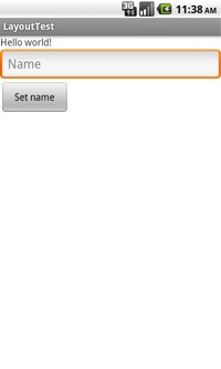
Run this (on your phone or on the emulator), and you should get a layout like the one at left. All three elements are laid out one under the other.
Element width and weight
You’ll notice that the three elements in our layout above mostly have either fill_parent or wrap_content set for their height and width. Although you can specify a pixel value (as with the Button here), much of the time it’s these two meta-values that are used. fill_parent means to fill the parent element in that direction (width or height); wrap_content means that the element should be just as wide or high as the content requires.
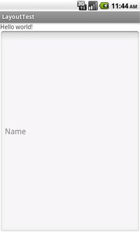 In the above example, all three elements have
 wrap_content as their height, so they are all squashed up to the top of the display. Try setting the height of the EditText element to befill_parent, and you should get the image at right. Note that you can’t see the button at all. The EditText element has duly filled the parent element (the LinearLayout), and there’s no room left for the button.
To get past this problem, but still spread the elements out a bit better, you can use the android:layout_weight attribute. This assigns an “importance” to the elements. The default weight is 0, and a higher number means a more important element. The most important element will be allocated more of the screen space. Try this:
<LinearLayout ... >
    <TextView
        android:layout_width="wrap_content"
        android:layout_height="wrap_content"
        android:text="@string/hello" />
   <EditText
        android:layout_width="fill_parent"
        android:layout_height="wrap_content"
        android:layout_weight="1"
        android:hint="@string/name" />
    <Button
        android:layout_width="100dp"
        android:layout_height="wrap_content"
        android:text="@string/setName" />
</LinearLayout>
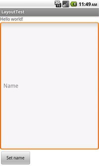
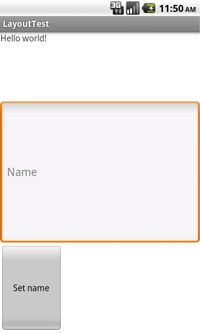
Now The EditText element has expanded to fill all the available space, like the image on the left, below. However, if you increase the weight of the EditText element to 2, and give the other two elements a weight of 1, you’ll get the image to the right, below. This time, because all of the weights are non-zero, once they’ve all been given their minimum space (wrap_content, so, the height of their content), the remaining screen space is divided in half. One half goes to the most important element, and the other half is divided between the two other elements.
If you want all your child elements to get exactly the same space on the screen, you shouldn’t use wrap_content, because that will allocate space to content first, and only then divide up the remaining space. Instead, set the height (or width, for a horizontal layout) to 0dp, then set the weight of each view to 1.
Layout attributes: Borders, padding, id…
There are a bunch of other layout attributes to further control the look of your layout. Here are a few commonly-used options:
android:gravity— aligns the content of the element within the element itself. So can be set totop,bottom,center,center_vertical, etc.android:layout_gravity— aligns the element within its parent. So to centre a button, use this; to centre text within a button, useandroid:gravity. Usable values are the same.android:padding— set the padding in pixels for all four edges. You can also usepaddingBottom,paddingLeft, etc.android:textColor— applies only to text elements, but you can use it to set the text colour.
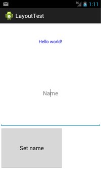
In the image below, the top two elements have both android:gravity and android:layout_gravity set to center; the button has only android:gravity set to center. So the text is centred within the button but the button itself is not centred.
When setting colors, you’ll need to either reference the Android built-in colours (note that many of the more interesting colours were only introduced with API 14, Ice Cream Sandwich):
<TextView ... android:textColor="@android:color/holo_green_dark" ... />
or to create your own colour with a res/values/colors.xml file:
<?xml version="1.0" encoding="utf-8"?>
<resources>
    <color name="blue">#0000FF</color>
</resources>
and refer to that:
<TextView ... android:textColor="@color/blue" ... />
For the (very long) full list of attributes for a given element, check out the API for that element. (Here’s the list for TextView, for example.) You can use XML attributes to set a field to have phone number input (rather than standard text), or to show dots instead of letters, as with a password field, or to automatically convert URLs into clickable links… check out the API for much, much more.
One final note on the android:id attribute, which we’ve already used in previous tutorials. When creating an ID for a new element, the usual format is @+id/name. The + indicates that it’s a new ID, and a new resource integer will be created for it at the next compile. For example:
<EditText android:id="@+id/nameEditText" ... />
You’ll need this if you want to refer to the element in your code (for example, to get a value that the user inputs into an EditText box).
Nesting layouts
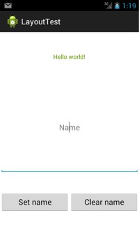
Finally, it’s possible to nest LinearLayouts within one another. This will get you a horizontal row of buttons at the bottom of a vertical LinearLayout, as in the image below the code:
<LinearLayout ... >
<TextView ... />
<EditText ... />
<LinearLayout
android:layout_gravity="center"
android:orientation="horizontal"
android:layout_width="fill_parent"
android:layout_height="wrap_content"
android:layout_weight="1" >
 <Button
android:layout_width="150dp"
android:layout_height="wrap_content"
android:layout_gravity="center"
android:layout_weight="1"
android:padding="5dp"
android:gravity="center"
android:text="@string/setName" />
<Button
android:layout_width="150dp"
android:layout_gravity="center"
android:layout_height="wrap_content"
android:layout_weight="1"
android:padding="5dp"
android:gravity="center"
android:text="@string/clearName" />
</LinearLayout>
</LinearLayout>
<Button
android:layout_width="150dp"
android:layout_height="wrap_content"
android:layout_gravity="center"
android:layout_weight="1"
android:padding="5dp"
android:gravity="center"
android:text="@string/setName" />
<Button
android:layout_width="150dp"
android:layout_gravity="center"
android:layout_height="wrap_content"
android:layout_weight="1"
android:padding="5dp"
android:gravity="center"
android:text="@string/clearName" />
</LinearLayout>
</LinearLayout>
Note that to center the buttons within the bottom row, the surrounding LinearLayout must be centered in its parent (with android:layout_gravity), as well as the buttons themselves centred, and their weight both set to 1. With more complicated layouts like this, you will often need to experiment a bit with the settings to get exactly the look you want. Make sure, of course, to check your layout on multiple devices; in a later tutorial we’ll look at developing for best appearance on multiple devices.


