
Author: JT Smith
From a developer’s perspective, one of the innovations in Symphony OS is Orchestra, a rapid application development environment that is being developed along with the rest of the distribution. Based on Mozilla, Orchestra allows GUI programs written in HTML and Perl to be used as local desktop applications. The result seems to be lightweight and responsive programs. However, from an end user’s viewpoint, Orchestra is overshadowed by the Mezzo desktop, whose UI experiments are more immediately noticeable.
Use and Installation
Symphony OS is primarily a live CD. Because it is a minimalist distribution that installs only about half a dozen programs beyond the core system files, it boots faster than most live CDs (see below). However, in one out of every three or four boots, it stalled or failed to load completely at the login or desktop, even when I carefully cleaned the CD beforehand.
The May 2006 release includes a program to automatically install Symphony OS to a hard drive. This feature removes the frustrations of the kludges needed to install earlier versions, but remains plagued by bugs. An option to install a compressed version for USB drives or small hard drives — admittedly marked as “not tested” — does not work. Similarly, although the dialog windows mention QTParted for hard drive partition, cfdisk is provided instead. Unfortunately, the included version of cfdisk could not partition any of my three test machines successfully; I had to use another live CD to create ext2 or ext3 partitions before the installer could do its job. Even then, the installer stalled now and then. Nor did it detect a PC Card (PCMCIA) on a laptop.
These teething problems aside, what is most noticeable about the installer is — like the rest of Symphony OS — its attention to interface issues. The program installs to the hard drive with only a few screens, each of which gives a full explanation of what is about to happen. One thoughtful touch is a Wait button that turns to a Close button when installation is complete. Because the installation creates default accounts and includes few packages, the process completes in well under 10 minutes, even on a five-year-old computer, with a minimum of interaction.
The Mezzo desktop
Logging into the Mezzo desktop, you are immediately confronted by UI issues. The reason is not that Mezzo is difficult to use. If anything, it comes closer to the mythical intuitive UI than anything I’ve ever seen. Small touches, such as color-coded widgets and bumpers that prevent a window from being moved off the desktop, show just how much thought the Symphony OS team gives to such issues.
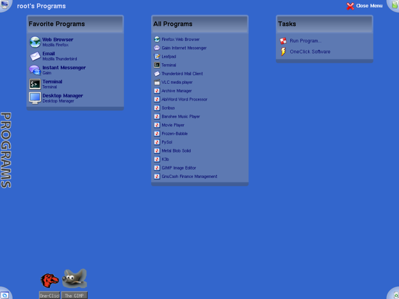
|
Symphony OS – click to enlarge |
Rather, Mezzo is so different from the GNOME, KDE, Windows, and OS X desktops that the differences are impossible to ignore. If nothing else, the fact that, in an effort to simplify, Mezzo uses no desktop icons, taskbars, popup dialogs, or right-click menus, has no dragging and dropping of icons, and offers — at least in this release — few customizable options, means that you are constantly facing implementations of the design theories behind Symphony OS, regardless of what you think of them.
One of the first comments in Spisak’s gray paper is that the corners of a desktop are underused. In response to this supposed oversight, Mezzo places what it calls targets in each of the four corners. From the upper left, you can access settings, devices, and systems level tasks, such as installing the distribution to a hard drive. The upper right includes a detailed set of locations for personal files, while the lower left has a program menu and the lower right the trash. This arrangement makes efficient use of available space, and it makes sense to put the trash in a remote position where it won’t be used accidentally. However, after experimenting with Mezzo for a while, I was left wondering whether there was a good reason for not using desktop corners in traditional design — namely, that they’re a long stretch with the mouse. Similarly, while Spisak’s comment about the comfort of familiarity are a sound argument for keeping functions where they are expected, should designers adhere to that principle when it makes for inefficiency? In particularly, the placement of the programs menu in the lower left has always seemed one of the least efficient places to put it, a tradition that began only because Microsoft wanted to avoid making Windows 95 look too much like the Mac OS. Moreover, in this case, it means that the upper left — the place where readers of most European languages look first — is abandoned to more rarely used administrative functions.
Spisak’s aims also include the avoidance of nested menus and scrolling. To achieve this end, targets do not open conventional menus. Instead, they open desktop-wide menus, in which desklets take the place of sub-menus. To remove the need for scrolling, items listed in the desklets are reduced in size as items are added to them. This arrangement works fine with Symphony OS’ default selection of packages. However, by the time you have added about two dozen programs, the reduced size of the text can be annoying — all the more so because programs are added to the general list in the order in which they were installed, not alphabetically. The result is far more annoying than the desktop full of icons (which Spisak rightly calls “the junk drawer of the modern computer”) that the desklets are intended to replace. But, to be fair, the problem may be at least partly relieved in future releases when the Desktop manager, which manipulates desklets and their contents, is fully functional.
A similar problem of scaling occurs with the taskbar for minimized programs. Minimized programs are displayed using full-sized icons along the bottom of the desktop. This arrangement works well enough with only a few programs, but, when enough are minimized, the later ones obscure the trash target. Open a few more, and other minimized programs are displayed down the left of the desktop, obscuring the top left target. What works well for a few programs is less successful for many.
Software selection and installation
Unlike most distributions, Symphony OS installs little beyond the core files for GNU/Linux and the X Window System. Firefox, Thunderbird, Gaim, and the VLC media player represent virtually the whole of the third-party software included by default. Some 230 packages are installed in all — compared with about 830 installed for a desktop environment for Debian, which until now has always been my standard for a modern minimalist distribution. The rationale, which seems to be to avoid overwhelming users with choices, is also sound security practice. However, does reducing anxiety also mean that new users will be less tempted to explore because they don’t know what is available? Many distros install a full range of programs in order to showcase their capabilities. Others, while offering fewer choices, have taken pains to ensure that some sense of the variety available remains.
Any users who install Symphony OS to the hard drive will probably want to install additional software. Symphony OS’ tool for installation is called One Click Software, which its interface explains is based on a program called Apt Plus. Both names are market-speak if you are thinking in terms of functionality. One Click Software actually requires five or six clicks to begin installing packages. Moreover, while the program offers one of the cleaner graphical UIs available for package management, it offers far fewer options than apt-get. In fact, so far as I can see, the current version offers no provisions for removing software. Are users really so cautious that they only download after careful consideration? Or does the availability of so much free software via a quick download encourage experimentation or shopping around? Moreover, should new users be introduced gradually to the complexity of package management, or given the full range of options right from the start?
Larger considerations
Possibly, the largest question raised by Symphony OS is: are GNU/Linux users consumers or customers? In other words, will they accommodate themselves to what is offered or expect that distros cater to their individual needs and preferences? By giving users every possibly option, KDE and GNOME tend to treat users as customers. By contrast, by exalting a reduced set of options into a design principle, Symphony OS — probably unintentionally — seems to treat users more like consumers. While the result is a desktop that is quick to learn, will users consider that an acceptable tradeoff for the current inability to customize?
No matter how you answer such questions, Symphony OS deserves kudos for raising them in the first place. Too often, software developers construct user interfaces more by borrowing than by considering actual needs or work flows. That is especially true in free software, where desktop designers sometimes seem to view the latest Windows desktop as the standard to measure themselves against. Even if you judge some of Symphony OS’ experiments a failure, at their worst they represent an effort to move beyond the received wisdom. And, at their best, they just may be part of the future of UI design.
Note: Since this article was prepared for publication, Symphony OS has sent out a plea for donations to help keep the project alive. Those interested in donating can find details at the project’s home page.
Bruce Byfield is a course designer and instructor, and a computer journalist who writes regularly for NewsForge, Linux.com and IT Manager’s Journal.


