Intel’s MeeGo team isn’t resting on its netbook-centric laurels. In February, the chipmaker released what it called a “developer preview” of a MeeGo user experience (or “UX”) for tablet computers. In April, it officially made the source code available too, making it one of the first publicly-visible glimpses at MeeGo 1.2.
As is frequently the case, the hardware that is officially supported for the Tablet UX preview is highly restrictive — specifically, only ExoPC Tablet products running on Intel’s “Pinetrail.” Luckily for those of us who don’t follow Intel’s CPU code-names, that’s just an Atom processor, so if you have an Atom tablet from 2010 or newer, the odds are that it will boot. Whether you get usable performance is another matter, but then again this is only a preview.
I had no trouble booting the Tablet UX on a Lenovo Ideapad S-10, which is convertible between netbook and tablet mode. Getting started is straightforward: the April release is provided for download as a disk image (with a .img file extension, which for all practical purposes is the same as a .iso image). Copy it onto a blank USB keychain drive using the tool of your choice; I am fond of Aaron Bockover’s image-usb-stick script. Then pop the USB drive into a free port on your tablet, and power up.
The MeeGo splash screen will let you run the Tablet UX from the drive in Live USB mode or start an installer. On my initial run-through, I choose Live USB mode because I wanted to test for basic support of the touch screen, keys, and networking hardware, but the system was fast enough even in Live USB mode that I continued to use it.
A Virtual Tour
The Tablet UX borrows a lot from the Handset UX in terms of layout, starting with the white-icon-on-black taskbar that is now common on every mobile platform and is making its way onto Linux desktop environments as well.
But the primary “home” screen is quite different; it uses a set of independent panels for common tasks, which float side-by-side. You flick-to-scroll horizontally between them; on the Ideapad only three fit on-screen at once. The panels include a “My Tablet” app launcher, a “Friends” newsfeed display, a “Music” panel with recently-played tracks and playlists, “Photos” and “Video” (oddly singular) launcher panels, and a “Web” panel with your recent history exposed as push-buttons. You can switch off all of the panels except for “My Tablet” from the settings app. I didn’t catch it initially, but the My Tablet panel provides access to common settings — network, sound, etc — if you flick upwards to scroll it vertically.
This basic “launcher” approach is very similar to the functional breakdown in Intel’s Moblin-derived Netbook UX, which uses the “tab” metaphor and drop-down tab selection widget that hides just off the top edge of the screen when not in use. I still don’t know if I simply miss the point or am far out of the mainstream among device users, but the multimedia tab and panel concept still feels like a waste of space to me. Honestly, how often do people fire up their tablet or netbook and say to themselves “okay, time to browse screen-by-screen through my own personal photo collection”? Is that really a common activity?
In my experience, when it comes to photos, we either open our device needing to find one particular photo to show someone, or (if it has a camera) to snap a new picture. That means “photo browser” isn’t a first-class operation. Neither is “video browser” or “music browser.” They make for colorful demo apps, but in day-to-day operation, we either launch the full player app (which you can already do from My Tablet without scrolling horizontally), or we need a search box. On the other hand, the web history integration is nice (it beats having to launch the browser first, then wait for your history to load), as is the recent item feed in Friends, and the Top Applications section of My Tablet does a good job of adjusting its offerings to match your app history.
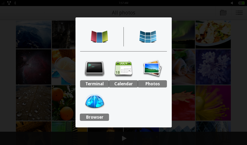
 You can tap on “View all applications” to bring up a screen with your full app library on it, in an interface that mimics the Handset UX almost exactly. It’s convenient, though I suspect the ability to choose which six apps are presented in Top Applications is more useful. Also borrowed from the Handset UX is the lock screen, which requires a finger-swipe to open back up.
The Tablet UX is clearly designed for a device with a hardware “home” button that the Ideapad lacks, but I found the keyboard’s Windows key does the same thing: hit it once, and you return to the home screen. Hit it again, and a running-application switcher pops up. That appears to be the only way to tell which apps you’ve left running in the background, and only by tapping-and-holding can you close an application.
Digging in further, although this is a preview release only, you can get a good feel for how UI items like settings, modal dialogs, and other widgets are intended to work. They are very finger-friendly: the buttons are sized for direct touch rather than a stylus, but at the moment this has the unintended side-effect of making all of the other UI widgets (such as title bars) Playskool-sized as well. There is a secondary method for activating the settings app (grab the top status-bar, and swipe down), but for whatever reason it only offers access to two of the settings menus, WiFi and sound.
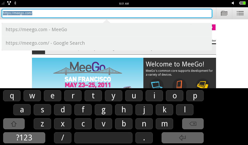
The on-screen keyboard is roomy and responsive. Keyboards (hard and soft) attract considerable brand-loyalty among some users, but I did not run into any real hardships using it. It uses a three-level layout, with just 31 keys onscreen at once: by default, it displays the alphabet; tapping the “?123” button brings up level two’s numeric and punctuation keys, and tapping “1/2” brings up level three’s currency and additional characters.
Hiccups
Make no mistake, when Intel describes the Tablet UX as a preview, they mean it in a very serious fashion. The release has some noticeable missing pieces, such as the lack of a file selector (which made getting screenshots off of the Ideapad quite a challenge), uncooperative Bluetooth, and the inability to manually add a WiFi network to the connection manager (which you’ll need if you don’t broadcast your SSID).
If you plan on running the preview release on an Ideapad like I did, be aware that several of the UI widgets are clearly sized for smaller screens, so (for example) there is dead space to one side of the on-screen keyboard. The Ideapad does have its own hardware buttons for functions like muting sound output, but they are not recognized. I also picked up on some UI weirdness that I’m not sure how to classify: in several situations, after you type the first character on the keyboard, it is automatically selected, which means it is then immediately erased when you type the second.
Perhaps most importantly, the preview runs as-released, and doesn’t take alterations. Although you can boot the Tablet UX from a USB key that stores a squashfs filesystem in a “LiveOS” directory, the system does not appear to actually use it to store files, and I was unable to get the system to recognize any other USB attached storage devices, even from the command line. Finally, you cannot add additional applications — at least not through any method I was able to discover, which is different from the MeeGo IVI UX and other previews I have seen.
Take-aways for Developers and Tablet Buyers
On the plus side, the installed apps do include a Terminal, so you can root around. As is the point of MeeGo, under the hood the Tablet UX is a fully operational Linux stack, and you get enough utilities to explore it and compare what it does to the Handset and Netbook UXes.
To me the most interesting part of this release is that Tablet UX’s main interface is written in Qt and QML, as opposed to the Clutter-based UI Intel wrote for the Netbook UX. It certainly looks pretty, and the transitions and animations are quick and display without tearing or jitter. I am not going to estimate as to whether the QML home screen or transitions are faster than the Clutter alternative. For one thing, if there is any speed difference, it is virtually undetectable. For another, rendering speed alone is a popular metric, but it is too simplistic to be the only important factor.
If you are an application developer, the Tablet UX preview gives you a nice playground in which to imagine your app. The real mettle will be shown when MeeGo 1.2 is officially released and a tablet SDK comes along. For now, all you need to know is that MeeGo tablets are going to provide as smooth a user experience as Android. Under the hood, you have a different set of questions to consider, but the MeeGo APIs are not substantially different between the various UXes.
This spring, a lot of virtual ink has been exchanged between the online pundits trying to predict what Nokia’s strategic smartphone “shift” means for MeeGo and Qt developers. At the very least, the Tablet UX shows that even if Nokia doesn’t care about migrating its phones to MeeGo this year (or next), Intel is still pushing forward, including work based on Nokia-originated components like QML.
If you’re a tablet buyer, you’ve got reason to be optimistic. This initial tablet offering is a good starting point. The real underlying advantages of MeeGo over Android, ChromeOS, webOS and other Linux-based platforms is supposed to be how easy it is for app developers from the Linux world to adapt to it. The Tablet UX shows a small, but highly functional suite of apps, and it wraps it up in a slick and user-friendly package. There is no product announced yet, but it looks like when it does arrive, it will deliver a comfortable experience.


