The 3D powerhouse Blender is arguably the most complicated piece of desktop software in the open source world. It handles every part of the workflow used to create a CGI film or a 3D game: creating objects, rigging them to move, animating them, controlling lighting, rendering scenes, and even editing the resulting video. Each release packs in more new features than most people can understand without consulting a textbook (or two). One of the down sides, though, is that over the years Blender has developed the reputation of being difficult to learn. Fortunately, the latest release takes on that challenge head-first, and makes some major improvements.
One reason Blender continually adds so many features is that The Blender Foundation funds its development by using it in real-world animation projects like Elephants Dream and Big Buck Bunny. Each movie is run like a commercial studio project, and whatever the animators need, the developers work on adding in to the next version of the app. The latest release is dubbed 2.56a, and is the result of the foundation’s recent Sintel movie project. Blender’s version numbering system is a bit quirky; all of the 2.5x series are officially tagged as “beta” releases; the “a” on the current version marks it as a minor bug-fix to 2.56.
You can download the latest release as source code, or as binaries for Linux, Mac OS X, or Windows, with 32-bit and 64-bit variants for each platform. The noteworthy dependencies are Python 2.5 and glibc 2.3.6. Blender also uses OpenGL for almost all of its interface, so if you don’t have a 3D capable graphics card, you can’t even get started. Unofficial packages for most distributions are available; the Blender forum is the best place to start looking for current information.
A New Look ‘n’ Feel
The 3D modelers and animators have plenty to like in the new release in the form of new tools and APIs. But what’s most interesting about this series are the changes made to the user interface.
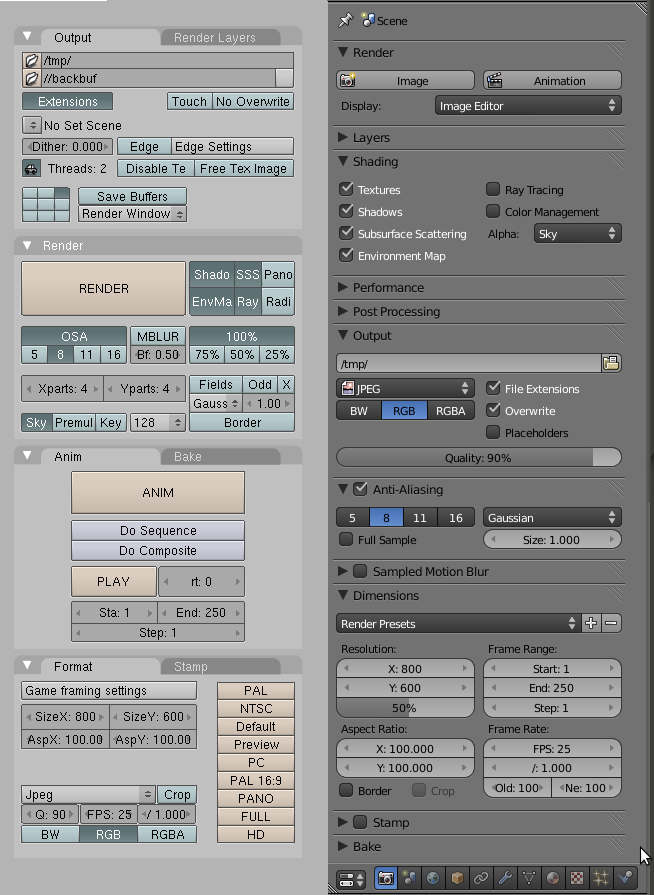
In previous release cycles, Blender was often criticized for its on screen interface and keyboard shortcuts. The controls and panels were cluttered, very text-label heavy, and used a custom UI widget set that was low-contrast and relied on subtle color variations to distinguish between active, inactive, and selected items. The keyboard shortcuts were unintuitive: they did not conform to common desktop defaults (i.e., Ctrl-S to save a document), some keybindings changed depending on which edit mode or screen you were in, and there were even multiple keybindings for some commands.
The Blender team was not blind to these issues, but the UI developed into its existing state over several years (starting as an in-house tool) — making a radical change risked hurting the existing users, particularly where keybinding were concerned. So the 2.5 development series took the important step of separating the UI from the underlying code, which would allow incremental changes but also let individual users retain things the way they preferred to work.
You can see this in Blender’s new Input User Preferences. Go to File -> User Preferences, and switch to the Input tab. This panel allows you to fully customize the input configuration: the keybindings for every action are configurable and are sorted categorically, and all of the mouse and 3D input controller settings are accessible, too. For each action, you can set a key-combination, a pointer button, or even a gesture trigger. You can save your settings to an external file, and load settings from files — including a preset example that mimics the UI settings of the proprietary tool Maya. The input settings are saved as Python scripts, which is one of the reasons fulfilling the Python dependency mentioned earlier is important.
The widget set has been given a much-needed refresh as well. There is more contrast between screen elements — although gray is still the default background color, text is rendered in black or white instead of grayish hues of purple. A lot of care went into making all of the widget styles consistent from one mode to another: selected items are always highlighted the same way, inactive buttons are de-emphasized by color and by flattening the 3D effect, and the previously vague line between buttons, spin boxes, and text input fields has been clarified, making each widget more distinct. The widgets themselves are customizable, although not through Blender’s UI itself — the configuration is also Python-based, but you must make changes in an external editor.
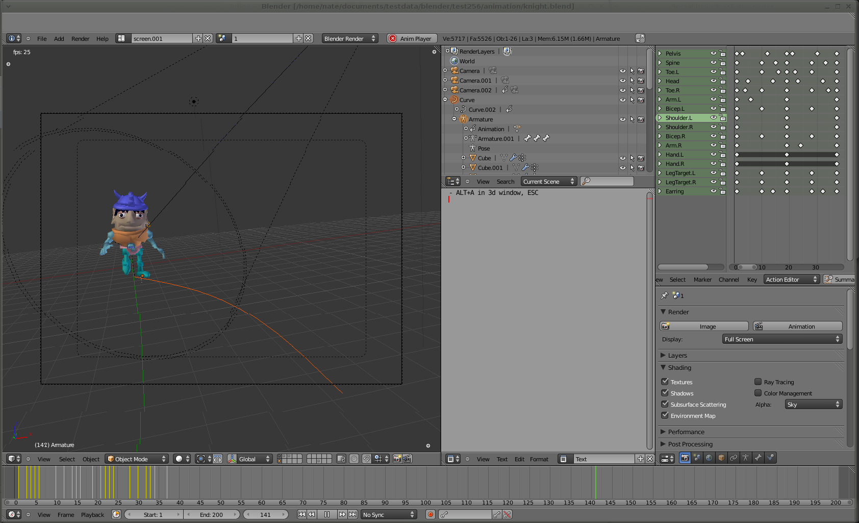
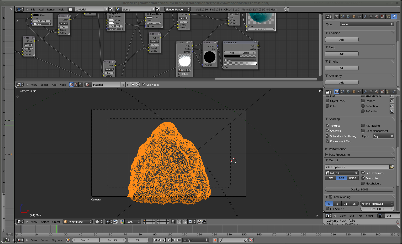
In addition to these basics, the revamp includes a new window manager that lets the user split toolboxes and object views into multiple windows, as well as re-arrange subframes within each single window. Most of this is done in an easily-discoverable way: a “gripper” appears in the bottom corner of each pane, grabbing it and moving it around resizes the window panes. Holding down Ctrl rearranges the window panes, which you might not discover on your own, but is hardly a hardship. The result is a considerably more configurable work space than the old one-size-fits-all (and one-size-prefers-full-screen) approach. Window settings are even saved in each project’s .blend file, so if you want to preserve custom configurations for different projects, you can.
Finally, several of the most important application windows have been reworked in this release. First is the property editor, the tabbed dialog that describes every facet of a 3D object’s existence in Blender, from its raw dimensions to its textures, materials, display attributes, and animation or rendering settings. The attributes have been re-sorted, grouped into more easily-understood categories that you can show or hide with a mouse click, and all of the lists cleaned up and aligned in an easy-to-scan visual arrangement.
Second is the file browser, which sports user-selectable list/thumbnail/column-browser modes as are found in most OS file managers, plus bookmarks, recently-used files, and filtering, all within the browser window. The improved browser is also integrated with the import and export tools, so you can (for example) filter for a particular file type in a large directory and save your exported work there — rather than browse the directory separately to make sure you haven’t already used the file name you wish to save to.
Blender extensions have been reworked internally so that all are now available as user-loadable Python modules. In concert with this change is a new UI for managing them, the Addons Manager. Yes, it seems like every application these days has an addons manager, but it’s still a welcome addition. Blender’s Python addons can be dynamically loaded, regardless of what portion of the application they affect, and the Blender crew has put together a nice Addons repository accessible through the Web.
Blender has three different animation editors: the graph editor for animating low-level attributes, the dopesheet for higher-level actions and groupings, and the NLA editor for video editing tasks. All three have been refactored for better usability and visual clarity, and they share the same layout and design metaphors, which ought to make them less confusing to switch between.
New Tools and Functions
The changes aren’t merely aesthetic, though — the revamped animation editors roll in a considerable amount of changes from Google Summer of Code projects. In short, basically everything in a Blender scene can be animated now. At the same time, the tool system was reworked and abstracted, so that tools are more like abstract operators that can be chained and scripted — this gives more power to the new addons system, making it easier to add new tools in future releases.
 And as with every new Blender release, there are indeed new tools in 2.56a. For example, the Solidify tool allows you to select a thin, planar object and automatically extrude thickness into it. There is a new paintbrush system, which lets you modify any brush’s size, strength, texture, and low-level behavior curves. Sculpt Mode, in which you modify objects by whittling or squishing them around, was also rewritten, making it easier to do multi-resolution sculpting (for example, sculpting at a rough resolution to define a character’s body, but working with much finer detail on its face).
You might have to be a 3D modeler to appreciate a lot of those changes, but there is new physics simulation code that almost everyone can get behind. The first is smoke simulation — always a tricky task because of the fluid dynamics (turbulence, collisions with solid objects, dispersion). Blender has had a “particle system” for a while, but it has been refreshed with new cloth and hair dynamics, plus what the Blender developers refer to as “unified gravity.” I can’t imagine any other kind.
There are also technical improvements like volumetric rendering (useful for the smoke simulations), rewritten network rendering code for render farms, and the first color management support in the editor — although at present all it does is make sure every step in the rendering workflow uses a device-independent, linear color spaces.
The Takeaway
I will be the first to admit that my eyes sometimes glaze over when trying to read Blender changelogs — even the detailed, illustrated ones the project documents on the wiki. The app encompasses so many tasks, you would have to be a full time 3D animator to stay on top of all of them: which makes sense, given that The Blender Foundation is essentially a full time animation studio. Nevertheless, I do think there is something important to note about the 2.5x development series even for those of us in other fields, and that is that the Blender team took a hard task — revamping the oft-criticized UI — and tackled it head-on.
They did not let the “it’s been this way too long to change” mentality prevent them from responding to bug reports and user feedback. I’m certain it was a long, extremely difficult process, but the application came out stronger at the end of it. What’s more, they took the opportunity provided by the UI recode to not simply clean up the design, but to refactor things like keybindings and widget look-and-feel into separate code, which will make further refinement all the simpler — particularly for power users who aren’t quite ready to dive into the core Blender codebase. The UI improvements you can see in 2.56 don’t make Blender a simple application, but they do make it less confusing to get started with, and that can only lead to more and happier converts.


