| Article Index |
|---|
| An Early Look at GNOME 3.0 |
| Page 2 |
| All Pages |
GNOME 3, the first major-version revision of the popular desktop environment in eight years, is slated for release in April. The good news is that you can now easily take the new release for a test spin with a spare USB key, and provide some real-world feedback to the project before the final code gets released into the wild.
To test GNOME 3 for yourself, you can download 32-bit and 64-bit ISO images built by Frederic Crozat. Crozat updated the first builds for FOSDEM, and said he plans to do so periodically; the underlying system is based on openSUSE. The images can be burned onto a bootable CD or DVD, but if you install them onto a USB flash memory stick instead, you can take advantage of persistence to preserve changes, documents, and additional packages you install. There are also Fedora-based images created by the distribution, and Ubuntu repository packages for GNOME Shell, the desktop user interface, although it is not clear how often either of the latter are updated.
I tested the openSUSE-based image on a flash drive (installed using Aaron Bockover’s nifty image-usb-stick imaging tool), as well as the Ubuntu repository packages. That’s because 3-D video card support is still flaky for the latest ISO image, and if the OS decides your card can’t do the proper compositing, you will get the version-2.x-era GNOME panel instead of the new shell interface and all of its constituent updates.
Some New GNOMEponents
That’s not to say that GNOME Shell is the only attention-worthy piece in GNOME 3 — it just gets the lion’s share of discussion. In fact, when going over what’s new and interesting about GNOME 3, quite a few other pieces come first.
That list starts with GTK+ 3.0, the basic widget library and application framework. GTK3 was officially released on February 10th, and it sports some impressive new features. First, all image drawing now goes through the Cairo graphics library, and the different rendering backends are swappable at run-time (including X11, Wayland, other OSes like Mac OS X’s Quartz, or even HTML5) , so an app can be compiled once and run regardless of the renderer needed. It also uses the newest XInput2 input layer, supporting multiple pointers, has D-Bus support built into the GIO I/O API, and features an array of new widgets for application developers. Finally, there is a brand-new theming API, which uses standard CSS syntax and supports animated transitions. Applications can even request a “dark” version of the current theme, a feature that ought to simplify the need many media creation apps feel to create a dark-gray, low-distraction interface via completely custom controls.

 A lot of work has gone into simplifying and unifying system status information (e.g., battery, sound, network, Bluetooth) and application pop-up notifications. In GNOME 2.x, these items were handled in a host of unrelated ways, with inconsistent behavior and placement. GNOME 3 cleans all this up, specifying the order and functionality of the status menus, which means a cleaner appearance and “what you expect” behavior like clicking on one menu and being able to slide the cursor into the next menu over. Notifications all pop up in the same place, at the same size, and behave the same way.
Plenty of low-level stuff is in there, too, even though you might not see it. GNOME is migrating away from the old gconf configuration system to GSettings, which uses dconf and will enable new features like PolicyKit. The “preferences” and “administration” menus from GNOME 2.x have been combined into a single control-panel application. There is also a new window manager named Mutter, which combines the existing WM features of Metacity with compositing like that done by Compiz.
The final word seems to still be out on Zeitgeist, the event-driven file activity log that is supposed to give users new and faster ways to retrieve documents. It was re-accepted into the fold in November, and work continues at a rapid pace, but it’s doubtful it will make the freeze date for 3.0’s release. Fortunately, it might still ship with the actual GNOME-based distributions a few months later.
The Shell Game
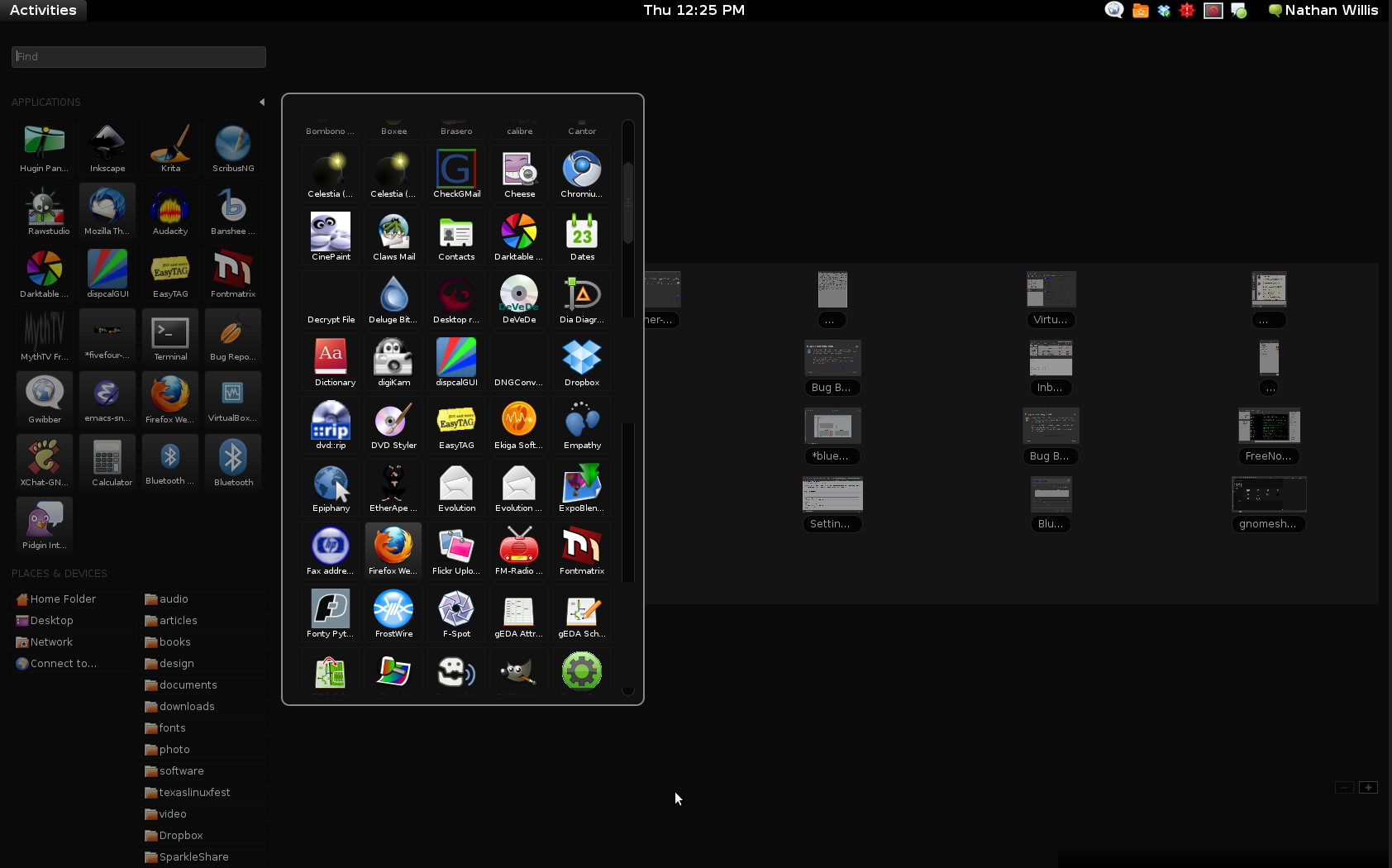
The most noticeable component of GNOME 3 is GNOME Shell, the new desktop interface that replaces the GNOME panel and various other window, menu, and task-switching components. The Shell gives you a black menu bar at the top of the screen, with a sparse selection of items in it: a few system status indicators, a combined system-shutdown/preferences/IM-status menu labeled with your first and last name, and the word “Activities” in the upper-left hand corner.
 You will probably expect clicking on Activities to open up a task-switcher or application menu, but it doesn’t. If you click on it, or if you move the cursor past it into the corner of the screen, up pops the “Activities Overview,” consisting of docks on the left- and right-hand sides, and a field of window thumbnails in the middle. The left-hand dock holds big icon buttons representing a mix of currently-running and frequently-used apps, shortcuts to your Nautilus filesystem bookmarks, and a handful of recently-opened documents. The right-hand dock holds thumbnails of however many active workspaces (e.g., virtual desktops) you have running. If you want to launch any app other than the ones with saved launchers in the left-hand dock, you much either search for it by name in the search box, or click on the triangle next to the “Applications” label, which brings up the “App Well” — a 2-D matrix of every application launcher installed on the system, sorted alphabetically.
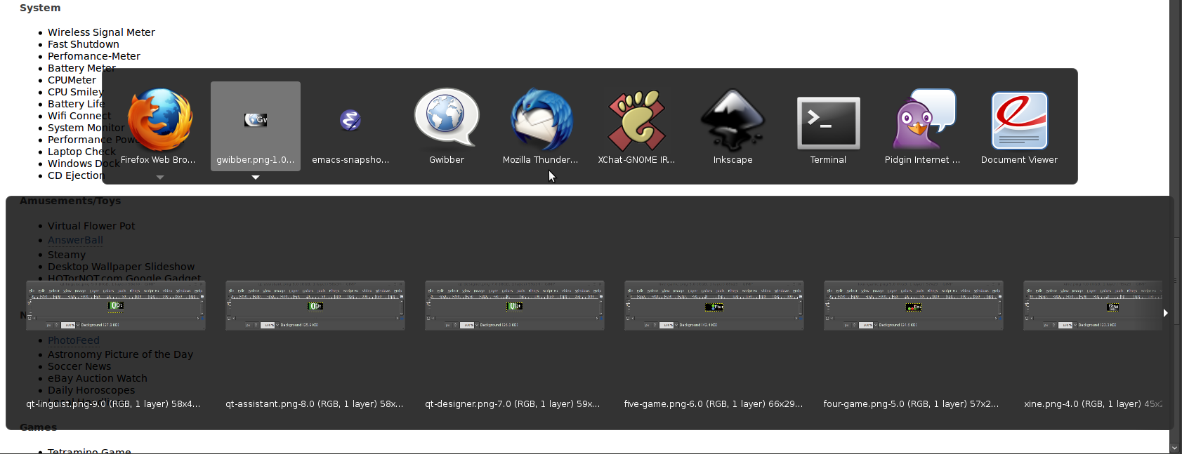
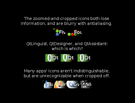
While you are using an app, its name appears in the system menubar, next to the Activities label and, bafflingly, halfway-superimposed on a zoomed-in and cropped-out version of the application’s icon. This label also looks like a menu, but if you click on the current app’s name, the only thing you can do is quit. In order to switch apps, you need to either open the Activities Overview and select its thumbnail, or use the Alt-Tab key combination, which brings up a thumbnail browser that you can tab through sequentially.
I went back and forth between the older Ubuntu repository version of GNOME Shell and the newer revision on the live USB image for about five days, and although there are a lot of good ideas involved, over time it becomes increasingly frustrating to use. Once the freshness and slickness of the UI elements wears off, you are faced with a system that imposes only one way to work on you, with no flexibility to adjust to your workflow. That’s very disappointing.


